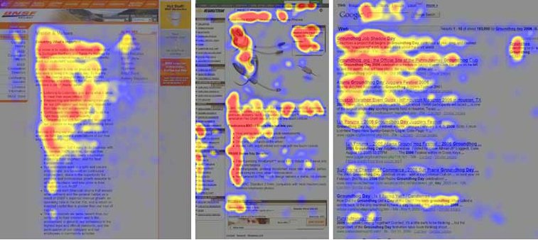
Analysis and research carried out around the world found that there are several templates on which the human eye scans the content on the screen in front of you. We will briefly consider some of the most common among them.
F-template
The so-called F-template got its name in that parts that occupy most of the observer's attention form a Latin letter F. This means a preview of a few words in the sentences at the top of the page, and then only one or two words as the glance go down.
This is the most common way to view one page, and it refers to all those who read from left to right, and it's natural for them to review the content. In addition, their eyes are accustomed to looking from top to bottom, forming an F template. In those who use the language in which the left hand is read, this template has the shape of the reverse letter F.

A template like a multi-layered cake
A tempting name for all gourmet finds that users read only a few rows of a single type of content, usually just a title and a subtitle, without considering the rest of the text. Then they switch to another theme, with which they do the same, by sorting the title layer to the subtitle layer.
Dotted template
Visualization of this review reminisces on the surface that is dotted, and refers to the individual's habit of focusing one spot on one website, then on the other, and then on the third, and so, literally, the screen looks out. What counts for their attention are the most common numbers, dates, percentages, and everything that is different from the rest of the text.

Focusing template
Anyone who hardly keeps attention on one kind of content, a focusing template can be a challenge. Namely, this is a review of a site that implies focusing the user's view on one spot or one type of content. Even when the mouse moves down, the focus of attention does not change.
An overjumping template
Now think carefully and be honest - how many times you happened to enter one site, and then just flip through the front page view and start scrolling down the page without any major interruption in reading or understanding the content, just so that See what's there? If something like that happens to you, it's possible that you review the content by skipping a template, as does a large number of other users. This particularly refers to the circumvention of the first words in the sentence, especially if the words are repeated.

A dedicated template
Even if it's hard for you to stay focused when new, attractive and intriguing information is coming from all directions, we are sure that there is at least something that interests you and that is able to attract your attention and retain it. We are talking about what occupies you completely, so do not notice that you read out the text from 2500 words from start to finish without a breath or have examined more than 200 photos without even blinking, or have you made a video online course and for 45 For minutes you learned a lot of the new, catching notes and notes as if you were really at a lecture. In such situations, you know that this is a dedicated template for interaction with content on the Internet.
Ideally, for website owners, it would be a cognition that every visitor is so dedicated and interested, that since his first entry to the site, he goes through a few hours until the moment of departure - because in the meantime he has reviewed all the pages, and he will gladly come back many times to read or see something new.
Nevertheless, there remains the question of attracting and keeping someone's attention when it comes to something that is not his narrow specialty or field of interest.
APPEARANCE OR CONTENT, THAT IS THE QUESTION
Is the content so important that it becomes even more important than the layout, or is the appearance of one page what the users first notice and what attracts or rejects them at first glance?
Opinions are divided. While some consider that the attractiveness and technological innovation of a site are crucial factors for retaining or abandoning further review, others are vowed by content supporters, whether text, photography, illustration or video, believing that without high quality and interesting material One site is not worth much.
The point is that the two concepts should not be separated. When questioning whether the crucial aspect or content is, therefore, the answer is - both appearance and content. The conclusion is that they can not achieve much without one another, but in tandem, if everything is done properly, they can perfectly fit and function impeccably, making the website very attractive, informative and functional.


Share the News